> ## Documentation Index
> Fetch the complete documentation index at: https://docs.near-intents.org/llms.txt
> Use this file to discover all available pages before exploring further.
# React Widget
> Add a cross-chain swap widget to your app in minutes
The **Intents Swap Widget** lets you integrate a fully functional, cross-chain swap interface into your application in just a few lines of code.
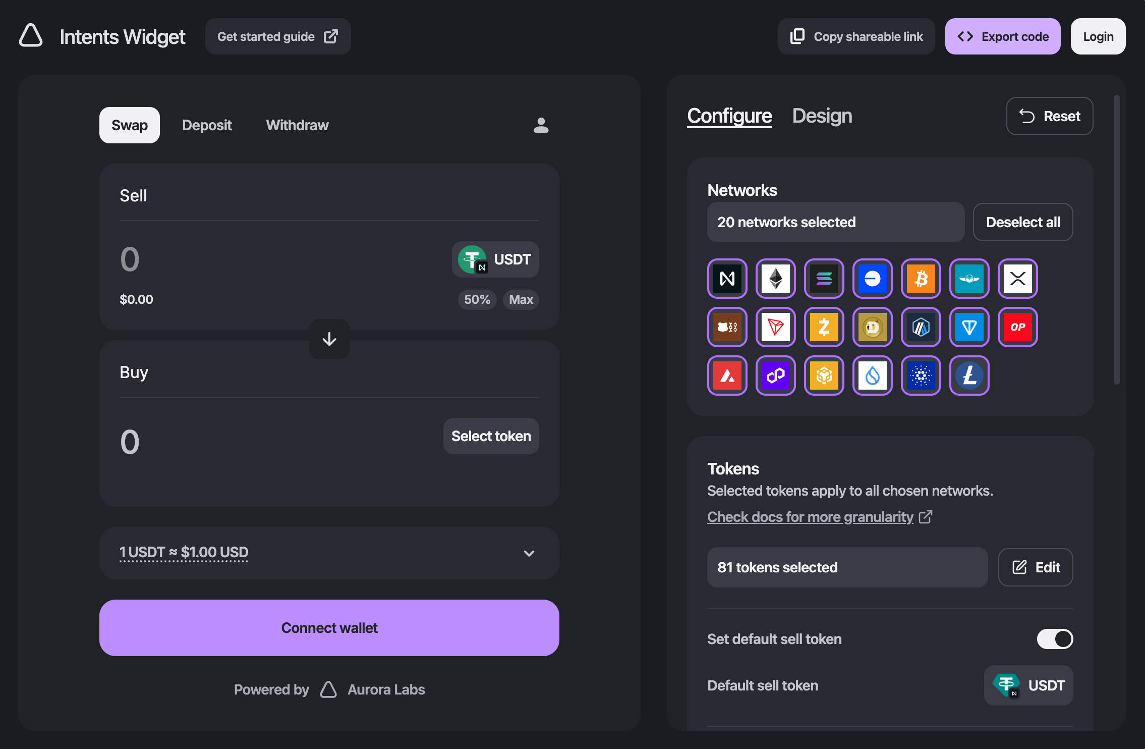 You can use the [Intents Widget Studio](https://intents.aurora.dev/) to customize the widget's appearance and behavior, then export the configuration for use in your app.
***
## Quickstart
Install the widget package using your preferred package manager:
```bash theme={null}
npm install @aurora-is-near/intents-swap-widget
```
Alternatively, if you want to use the widget in standalone mode with embedded wallet connection mechanisms:
```bash theme={null}
npm install @aurora-is-near/intents-swap-widget-standalone
```
Wrap your app, or just the area where the widget appears, with the `WidgetConfigProvider`, then render one of our prebuilt widgets within it.
For example, the snippet below shows how to render the combined widget.
```tsx theme={null}
import {
WidgetConfigProvider,
Widget,
} from '@aurora-is-near/intents-swap-widget';
export default function App() {
return (
);
}
```
There are also individual `WidgetSwap`, `WidgetTransfer`, and `WidgetWithdraw` widgets.
For a full list of configuration options, see the [Configuration](https://docs.intents.aurora.dev/readme-1-1) page.
To apply styles, you need to import the package styles into your app's stylesheet, for example:
```css theme={null}
@import '@aurora-is-near/intents-swap-widget/styles.css';
.my-class {
background-color: #fff;
}
```
For more details about the available theming options, see the [Theming](https://docs.intents.aurora.dev/theming) page.
If you are using standalone mode, the wallet connection mechanism is built in.
If you want to use your existing wallet integration (e.g., AppKit, Provy, TonConnect), you can pass the connected address via the `connectedWallets` config option.
Here is an example that assumes you are using [AppKit](https://docs.reown.com/appkit/overview) and have a hook that provides the wallet address and a button for connecting.
```tsx theme={null}
import {
WidgetConfigProvider,
Widget,
} from '@aurora-is-near/intents-swap-widget';
import { useAppKitWallet } from './hooks/useAppKitWallet';
import { WalletConnectButton } from './components/WalletConnectButton';
export const SimpleWidgetDemo = () => {
const { address: walletAddress, isConnecting: isLoading } = useAppKitWallet();
return (
}
/>
);
};
```
***
## Next steps
Explore the [Widget Docs](https://docs.intents.aurora.dev/readme-1-1) for detailed information on configuration options, theming, and advanced usage examples.
You can use the [Intents Widget Studio](https://intents.aurora.dev/) to customize the widget's appearance and behavior, then export the configuration for use in your app.
***
## Quickstart
Install the widget package using your preferred package manager:
```bash theme={null}
npm install @aurora-is-near/intents-swap-widget
```
Alternatively, if you want to use the widget in standalone mode with embedded wallet connection mechanisms:
```bash theme={null}
npm install @aurora-is-near/intents-swap-widget-standalone
```
Wrap your app, or just the area where the widget appears, with the `WidgetConfigProvider`, then render one of our prebuilt widgets within it.
For example, the snippet below shows how to render the combined widget.
```tsx theme={null}
import {
WidgetConfigProvider,
Widget,
} from '@aurora-is-near/intents-swap-widget';
export default function App() {
return (
);
}
```
There are also individual `WidgetSwap`, `WidgetTransfer`, and `WidgetWithdraw` widgets.
For a full list of configuration options, see the [Configuration](https://docs.intents.aurora.dev/readme-1-1) page.
To apply styles, you need to import the package styles into your app's stylesheet, for example:
```css theme={null}
@import '@aurora-is-near/intents-swap-widget/styles.css';
.my-class {
background-color: #fff;
}
```
For more details about the available theming options, see the [Theming](https://docs.intents.aurora.dev/theming) page.
If you are using standalone mode, the wallet connection mechanism is built in.
If you want to use your existing wallet integration (e.g., AppKit, Provy, TonConnect), you can pass the connected address via the `connectedWallets` config option.
Here is an example that assumes you are using [AppKit](https://docs.reown.com/appkit/overview) and have a hook that provides the wallet address and a button for connecting.
```tsx theme={null}
import {
WidgetConfigProvider,
Widget,
} from '@aurora-is-near/intents-swap-widget';
import { useAppKitWallet } from './hooks/useAppKitWallet';
import { WalletConnectButton } from './components/WalletConnectButton';
export const SimpleWidgetDemo = () => {
const { address: walletAddress, isConnecting: isLoading } = useAppKitWallet();
return (
}
/>
);
};
```
***
## Next steps
Explore the [Widget Docs](https://docs.intents.aurora.dev/readme-1-1) for detailed information on configuration options, theming, and advanced usage examples.